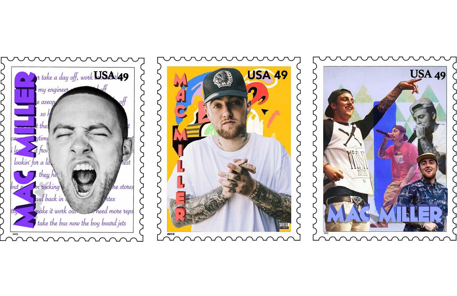
The strongest technical aspect of my work is combine different pictures and colors to create the stamps. I used multiple pictures of Mac Miller in the repetition stamp. I changed the opacity of some of the pictures to make them look faded and in the background. I faded the background picture of one of Mac Miller's albums by changing the opacity and put a blue background behind it to make it look faded. In the minimalist stamp, i used another one of his album covers and used it as the background. I took a really basic picture of him and put his name in a 3D font going down the side of the stamp, which i thought looked good. In the typographic stamp, i used lyrics from one of Mac Miller's songs as the background using a font and color that was eye catching but relaxed. I used a picture of his face, from one of his newer album covers and made it the focal point of the stamp. I wrote his name in a big 3D font going down the side of the stamp to make it stand out and noticeable. My favorite stamp is the minimalist stamp because i like how the background and his name, the colors correspond yet his name still stands out. I like that the picture of Mac Miller also stands out in the picture too. The technical aspect that could've been worked on was the typing of some of his lyrics in the background of the typography stamp. It could've been done better and look more professional.
The easiest part of this project was choosing pictures of Mac Miller, cutting them out using the pen tool, deleting the background of the pictures, and putting them into the stamps. Choosing a color scheme and a way to write Mac Miller differently on each stamp was also pretty easy. The most difficult part was finding ways to create the minimalism, repetition, and typography. It was challenging to find lyrics to put into the background of the typography stamp. It was difficult to create a way to create repetition in a stamp but still make it eye catching and look good. Out of all three stamps and approaches, the minimalist one was the easiest and in my opinion the best one.
The objective of this project is to create a series of three multi-layered postage stamps that are visually connected by color and theme. Each stamp should represent your person, place, or event based on the following three approaches: typography, repetition, and minimalism. I demonstrated this objective by creating three stamps, one minimalist, one repetition, and the other one typography. I used the pen tool, changed the opacity, and used the 3D tool to create the most eye catching and creative stamps. If i could do this project again, i would choose a better ways to create the typography stamp, not just using basic song lyrics as the background. I would also come up with a better way of creating repetition.
The triptych is clearly unified by theme but visually connected by color could be improved upon. My favorite stamp is the one in the middle. It seems to suit his personality. I like the orange font against the dark tattoos. The "USA 49" is bold like the background and easy to read.
ReplyDelete